
Beyond Beige: 5 Ways to Elevate "Cream Style" Interiors with Wall Art | FineArt Studio
In our fast-paced world, home is not just a place to sleep—it is a sanctuary for the soul. This is why the "Cream Style" (also known as Warm Minimalism) has taken over social media.
Warm beige walls, rounded furniture lines, and low-saturation earth tones create an undeniably relaxing atmosphere. However, many homeowners face a common dilemma after the renovation is done: An all-beige room, while clean, can often feel "flat," monotonous, or lacking in soul.
Actually, breaking the monotony and elevating the texture of your space is simple. You don't need to repaint; you just need the right piece of wall art.
Today, we have curated 5 representative works from FineArt Studio. From color psychology to spatial layering, we’ll show you how to use art to inject "breathing room" and high-end texture into your neutral sanctuary.
01. Tone-on-Tone Serenity: Adding "Breathing Room"
The Strategy: If you want to maintain the pristine purity of your space, opting for artwork in a similar color palette (tone-on-tone) but with translucent textures is the most sophisticated choice.
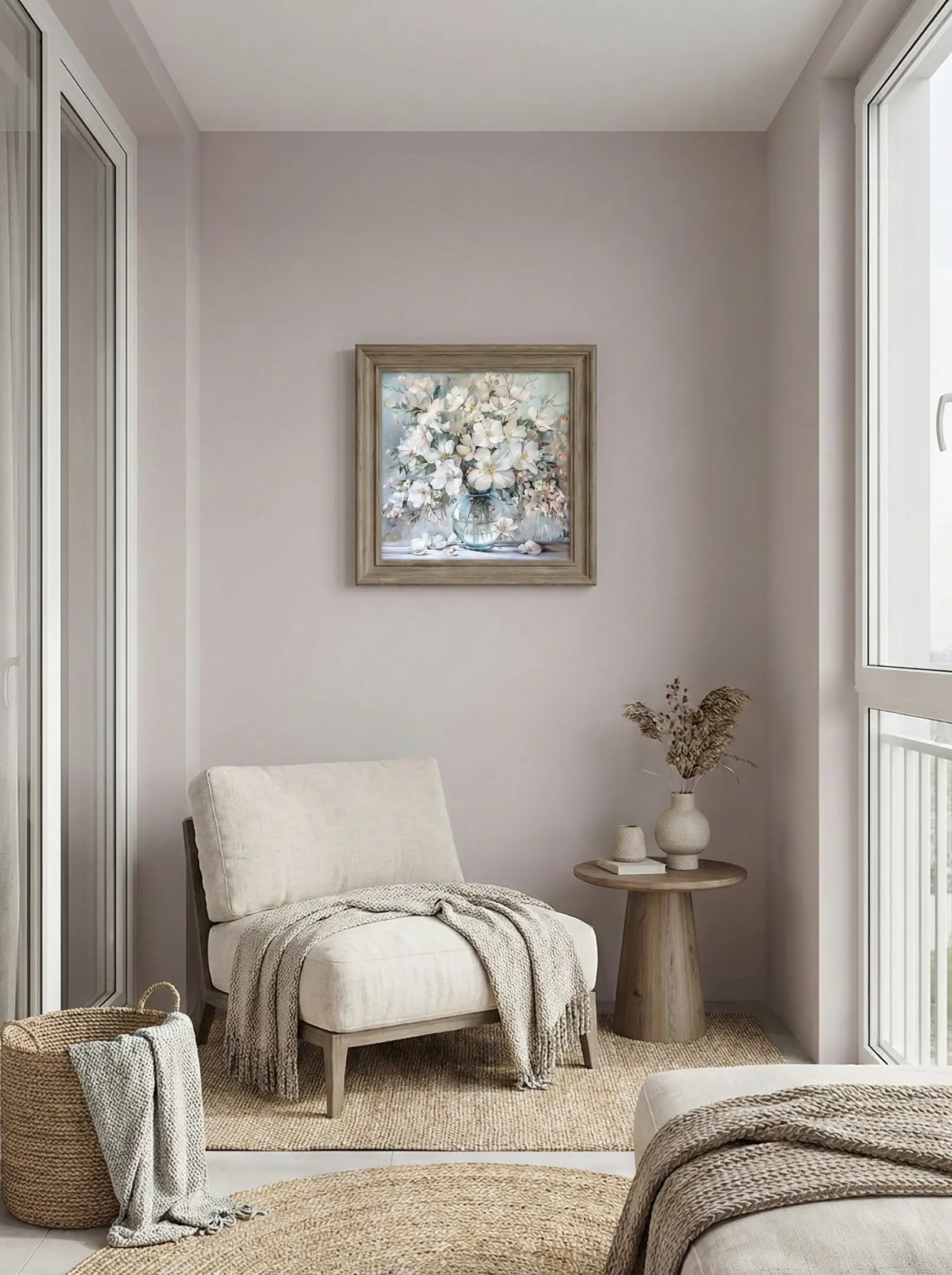
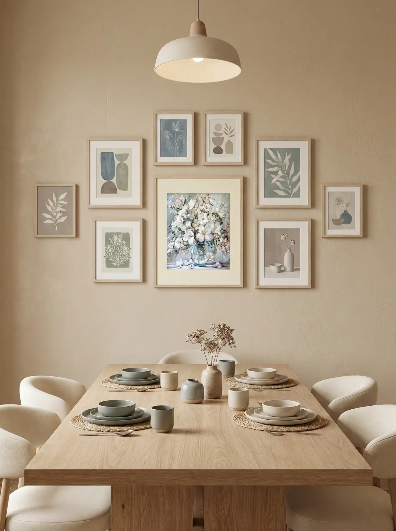
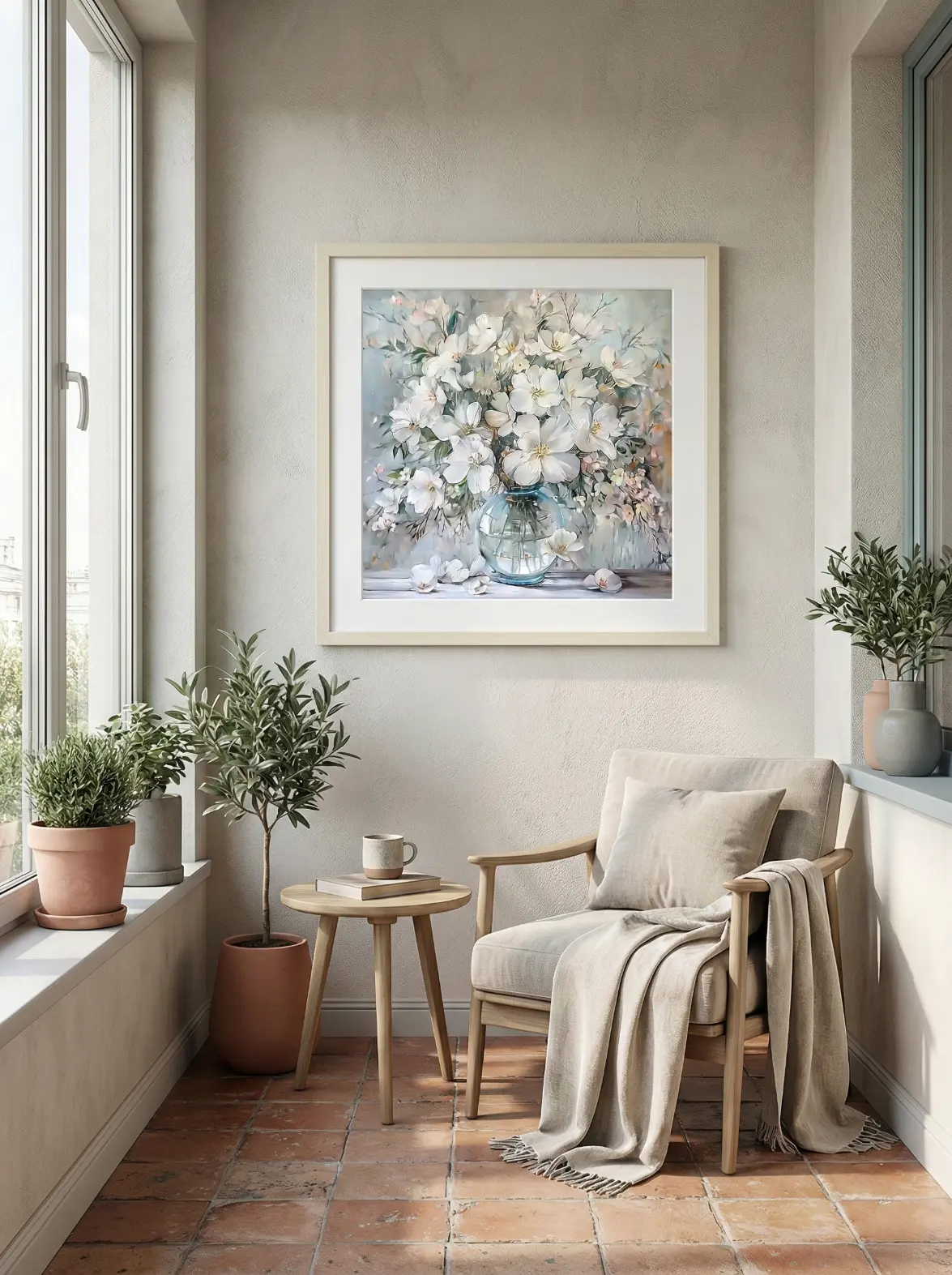
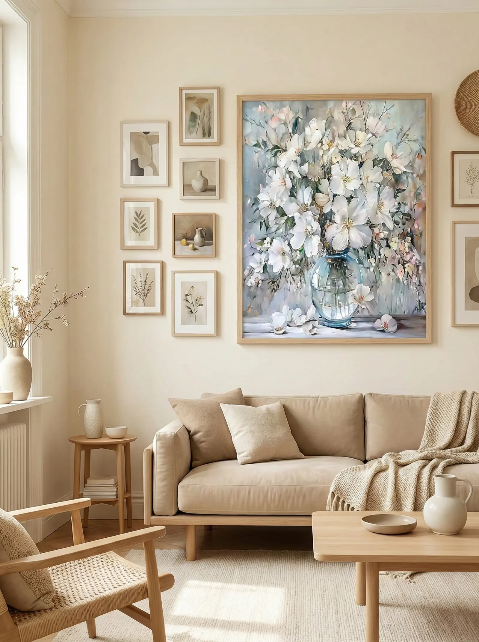
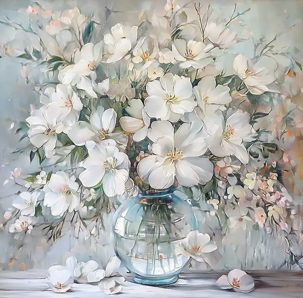
Featured Work - White Blossoms01: This painting depicts a lush bouquet of white flowers arranged in a transparent, round glass vase, creating a fresh, elegant, and soft spring atmosphere.
Why It Works: The pristine white florals combined with the translucent texture of the painted glass perfectly extend the gentle, low-saturation base of a Cream Style room. More importantly, it introduces a sense of "visual airiness" that lights up warm beige spaces. This pairing maintains visual purity and avoids color conflict, while the natural organic shapes of the flowers add an elegant fluidity to the rounded lines of modern furniture, filling the home with a light, healing spring vibe.
02. A Touch of Whimsy: The Visual Focal Point
The Strategy: Cream interiors don't have to be serious. Introducing soft pinks and greens can instantly give your home a relaxed, "French chic" personality.
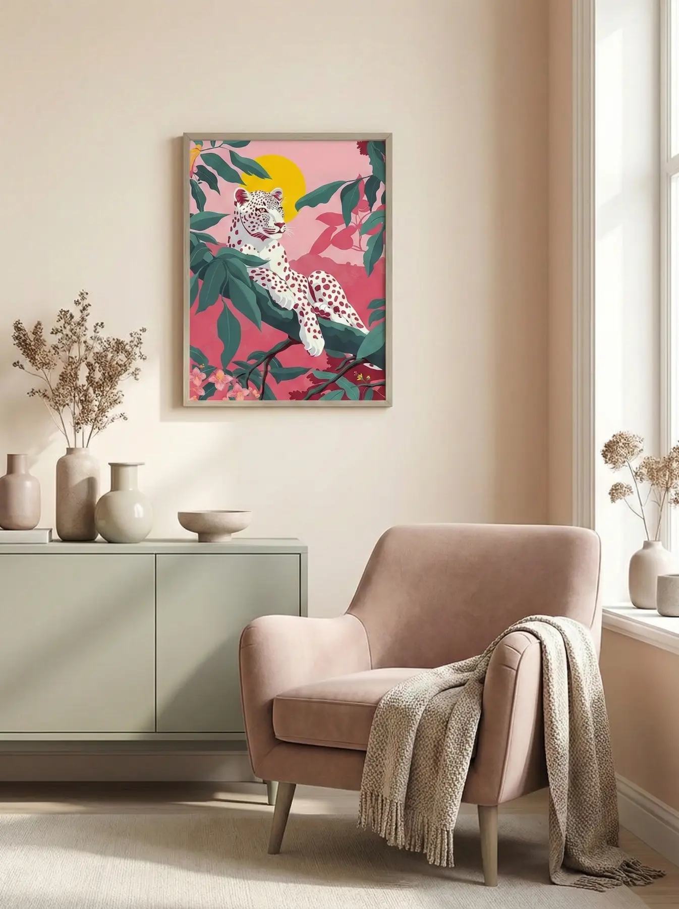
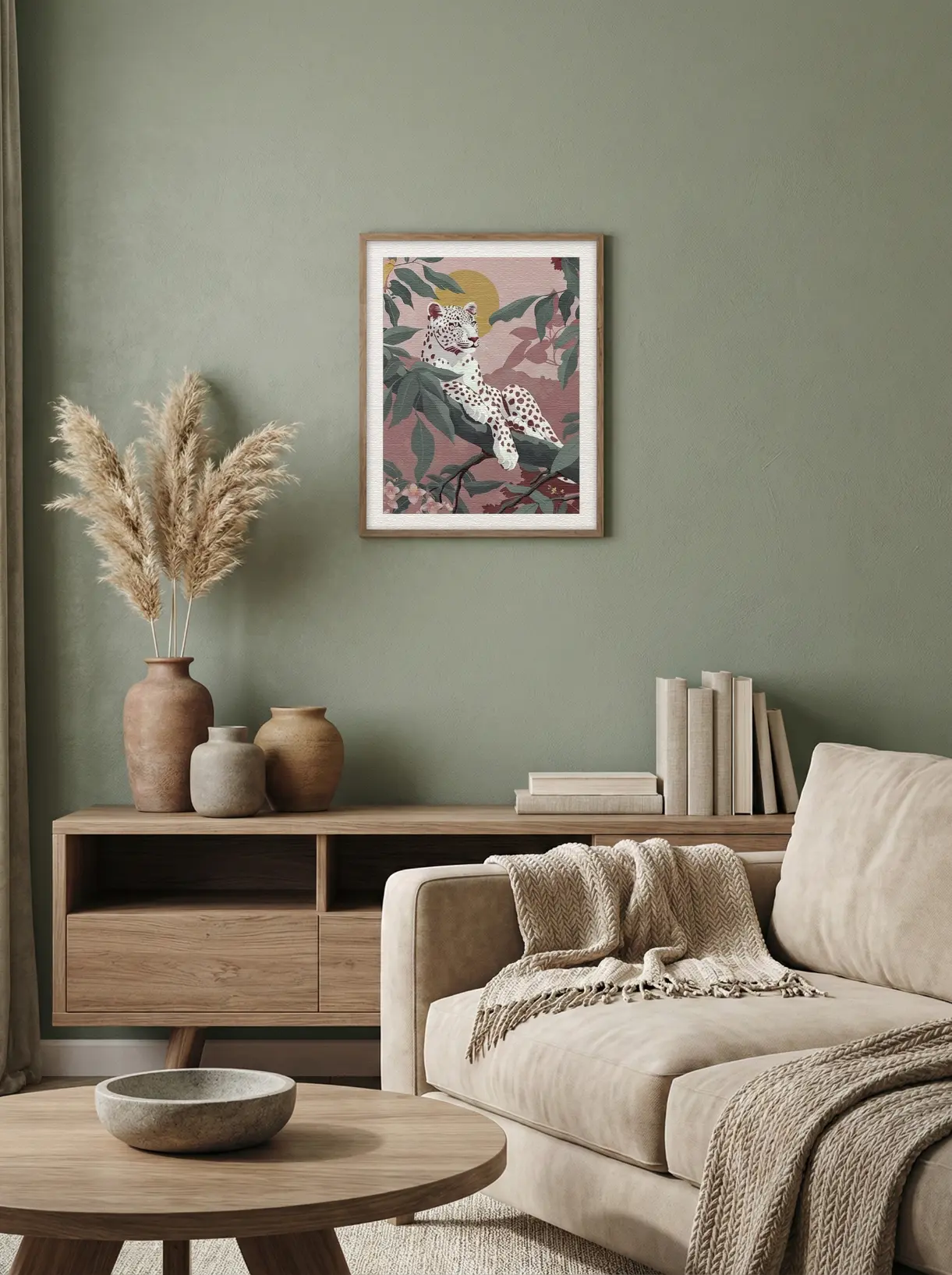
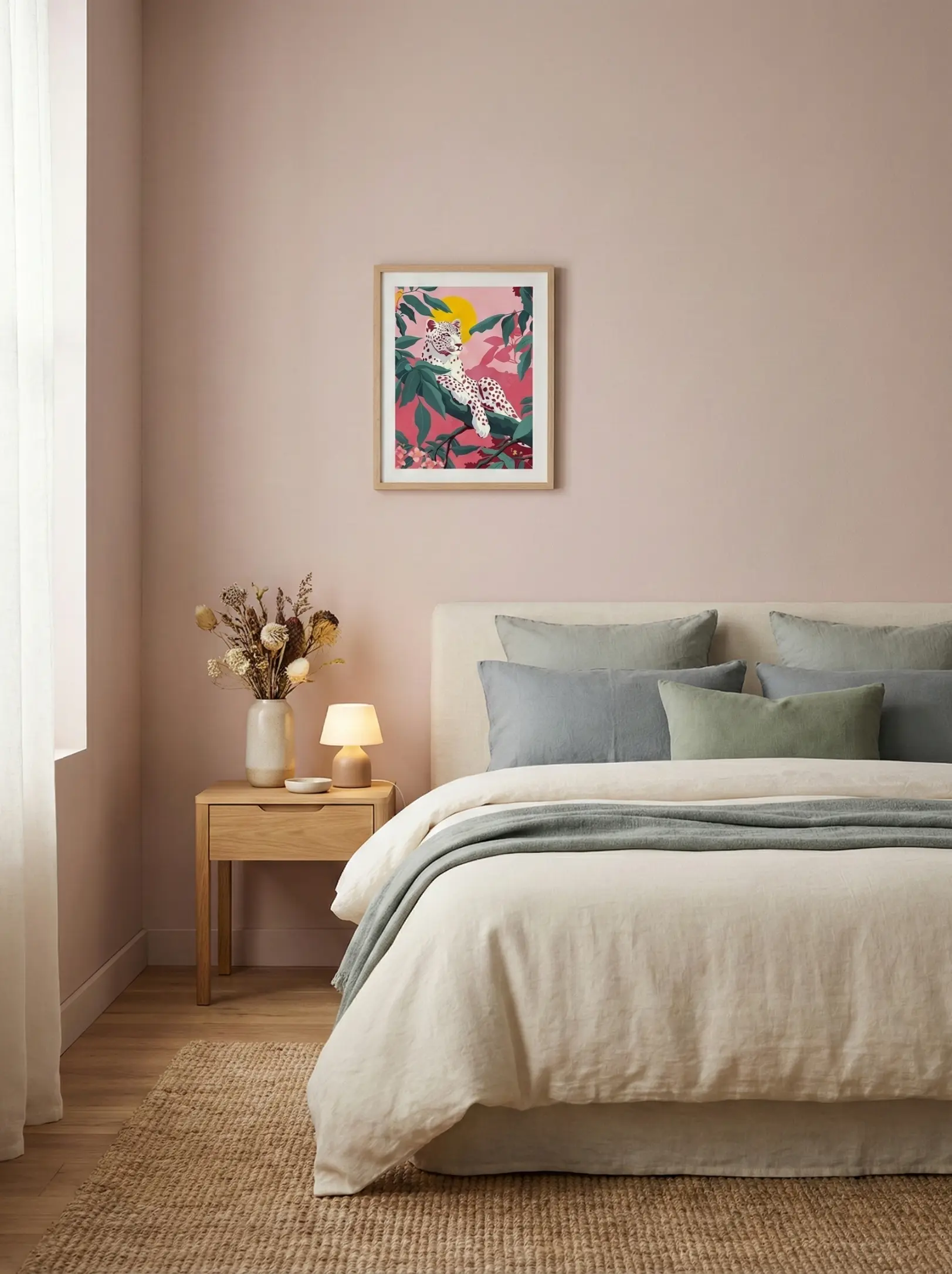
Featured Work - Leopard Pink: This stylized illustration features a white leopard with unique pink spots resting on a branch. The background is a vibrant pink hue, highlighting lush green leaves and a bright yellow sun.
Why It Works: The large areas of soft pink and fresh green foliage form a brilliant complementary contrast to the warm beige walls and light wood furniture. It breaks the "flatness" of a solid-color space, acting as an instant visual anchor. The artwork echoes the "healing" core of the aesthetic but adds a lazy, relaxed attitude—bringing a touch of artistic individuality and romantic charm to a cozy home.

03. Textured Strength: Adding Depth and Layers
The Strategy: When your furniture is soft (fabric sofas, wool rugs), your walls need something "substantial" to ground the room. Heavy texture is the key.
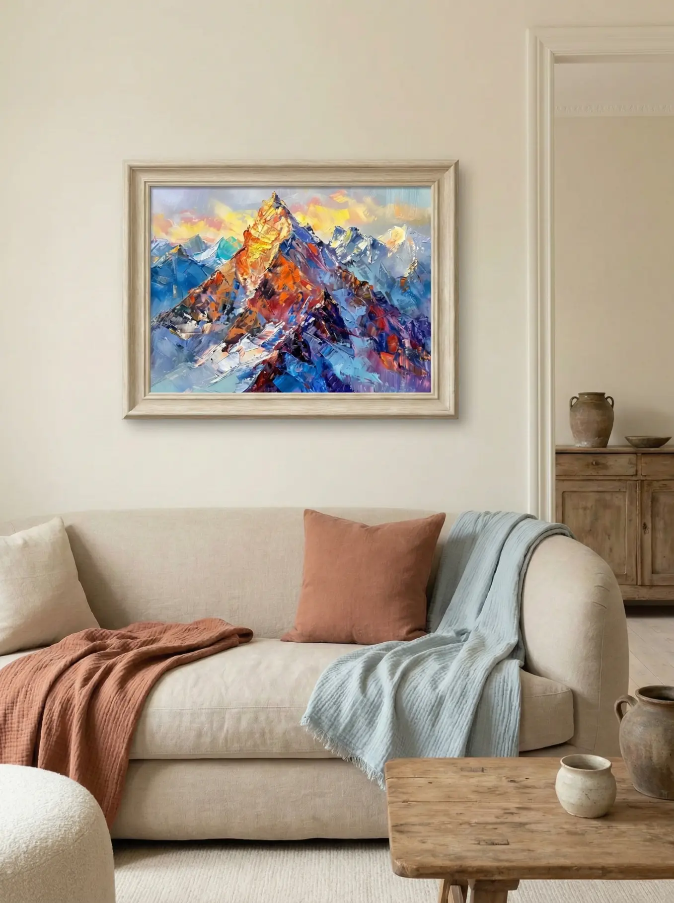
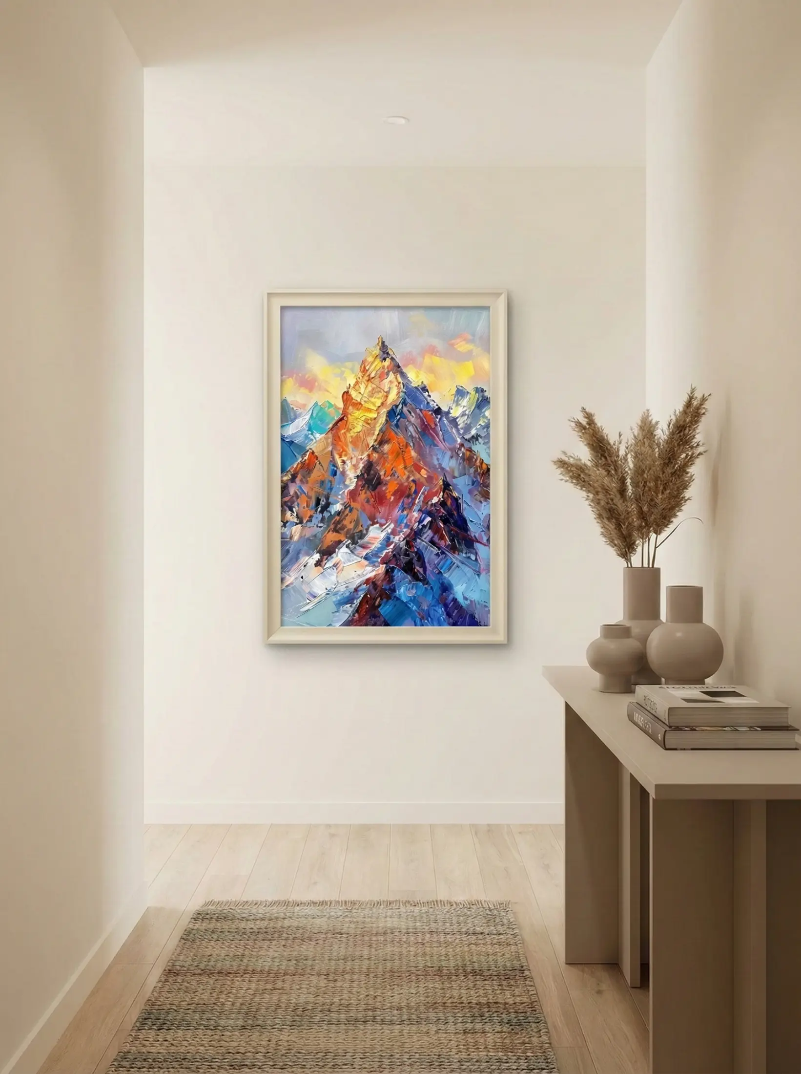
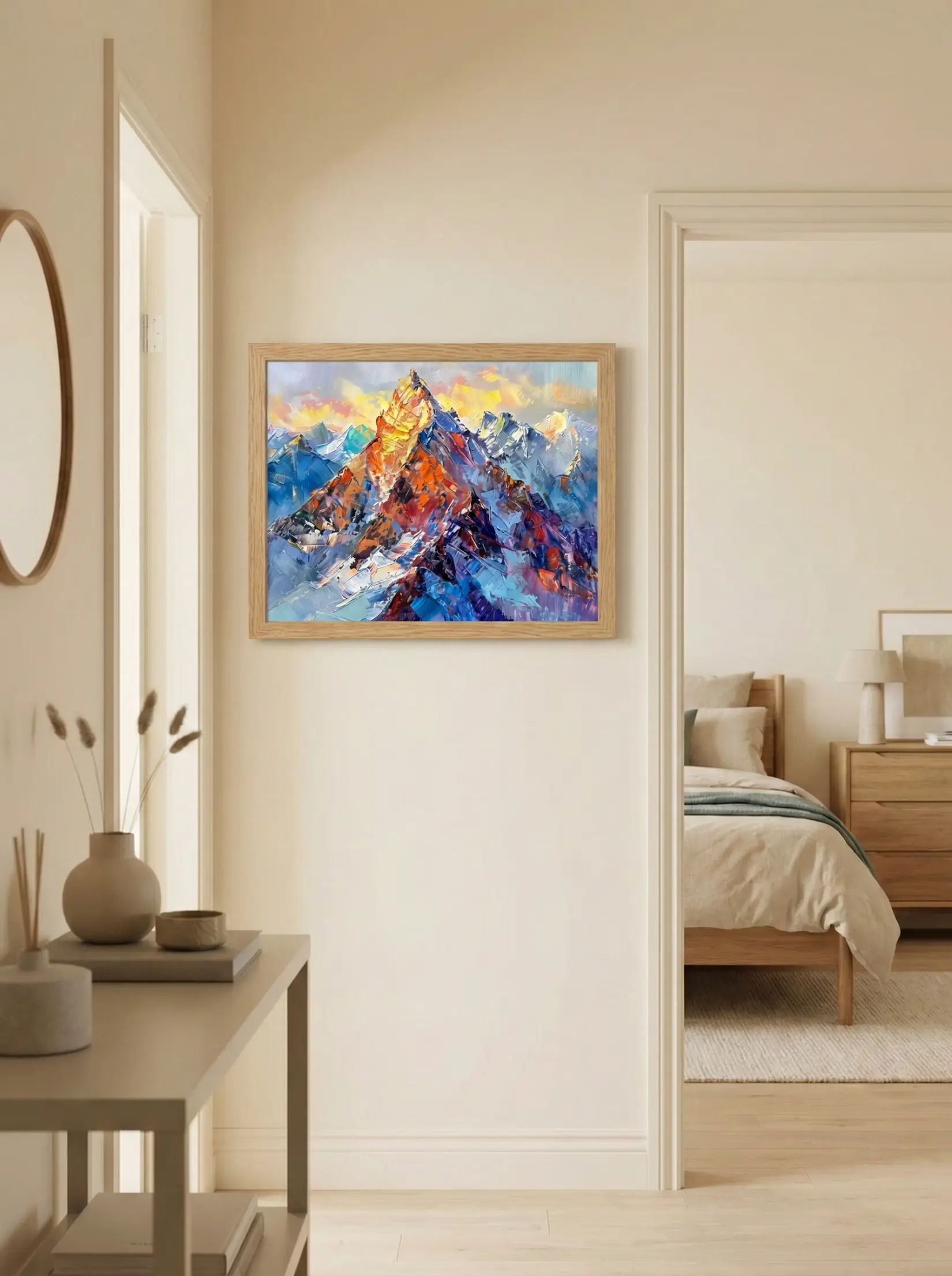
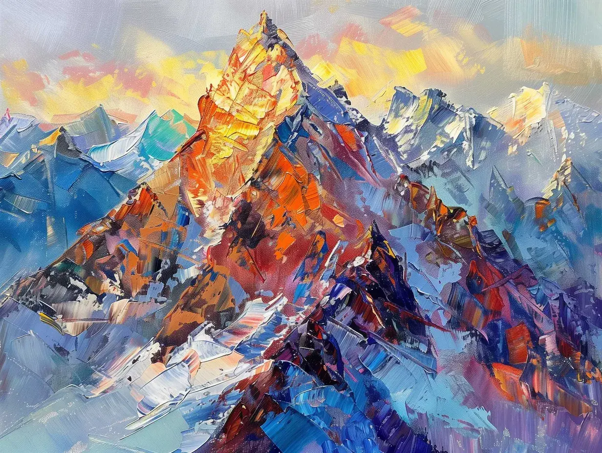
Featured Work - Golden Mountain04: This richly textured painting depicts majestic peaks bathed in golden sunlight. Heavy impasto brushstrokes create a dynamic contrast between the warm, fiery red summits and the cool, deep blue slopes.
Why It Works: The golden warm light at the top of the painting resonates deeply with the room’s beige undertones, while the cool blue mountain body—rendered with thick Impasto technique—breaks the smoothness of the wall. This injects a sense of firm, magnificent artistic power into a minimalist space. It’s a "soft yet strong" combination that utilizes temperature contrast and texture collision to instantly elevate the room’s sophistication and depth.
04. Coastal Calm: Balancing the Warmth
The Strategy: Too much beige can sometimes feel "stuffy" or overly sweet. Introducing a cool, oceanic palette creates a perfect thermal balance.
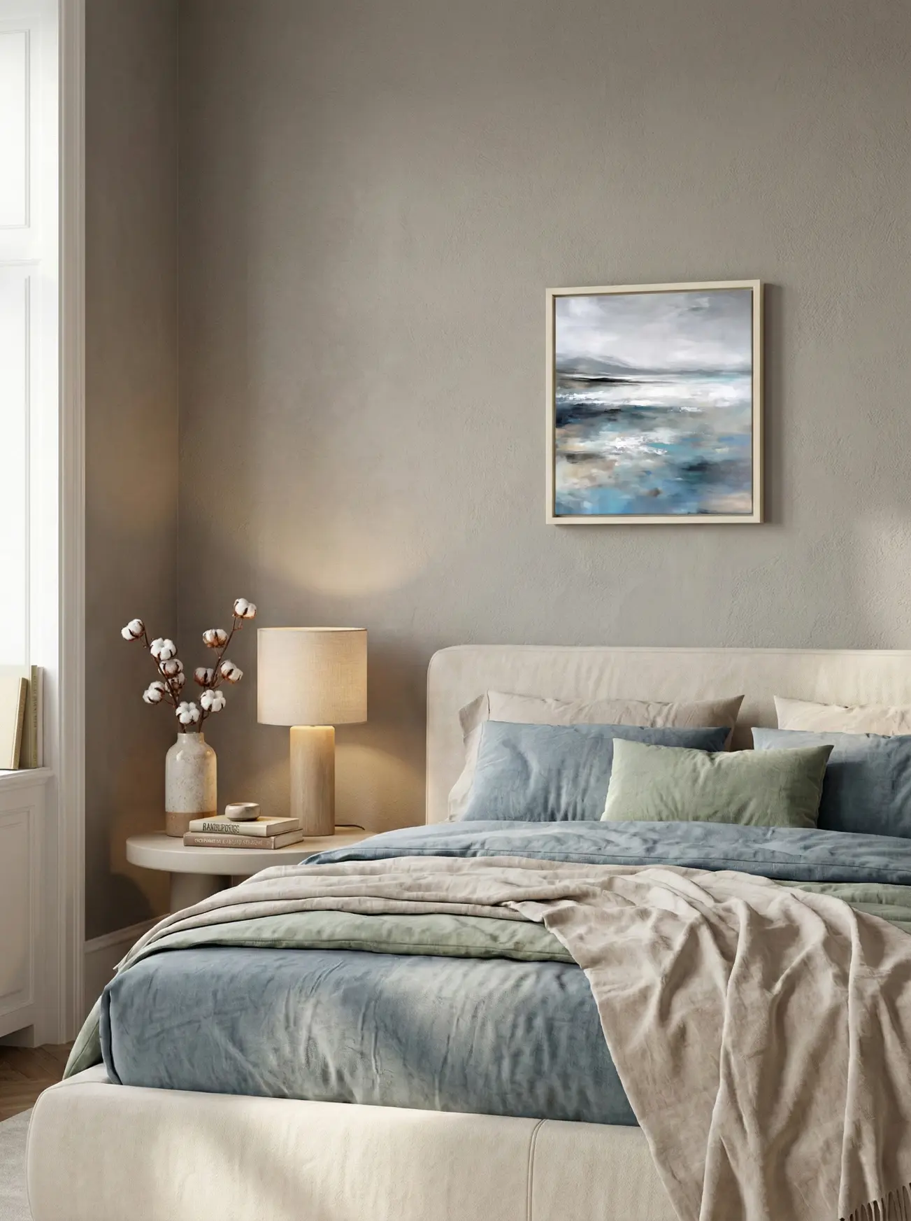
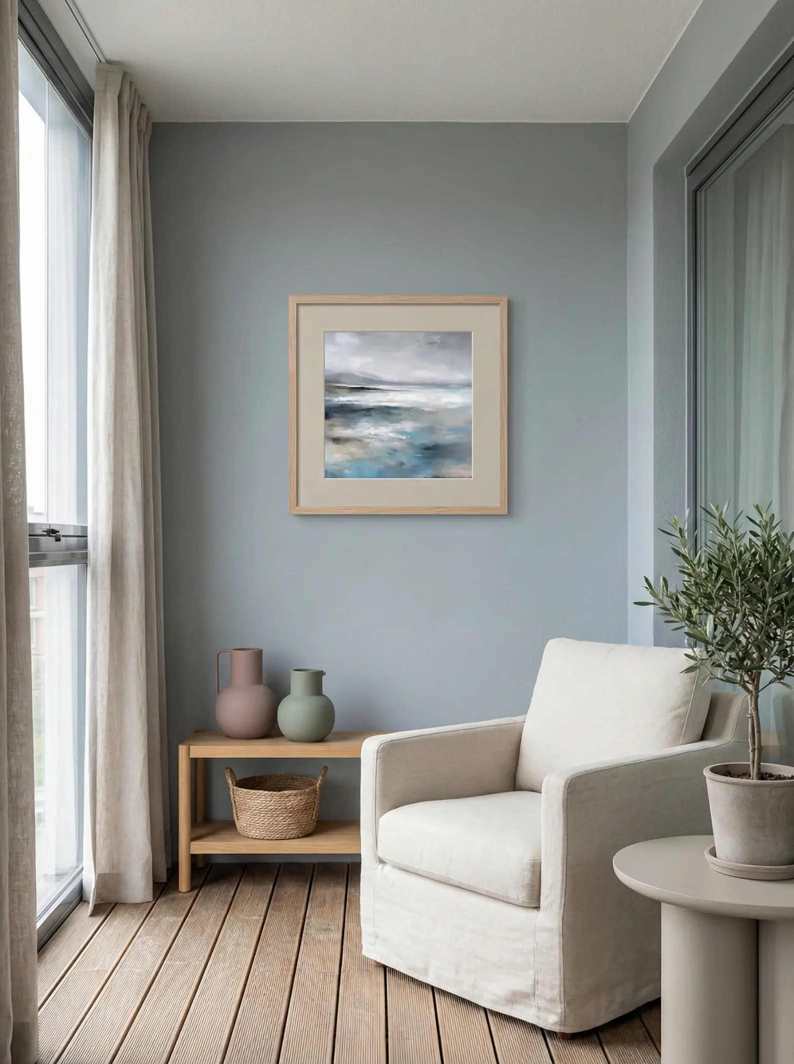
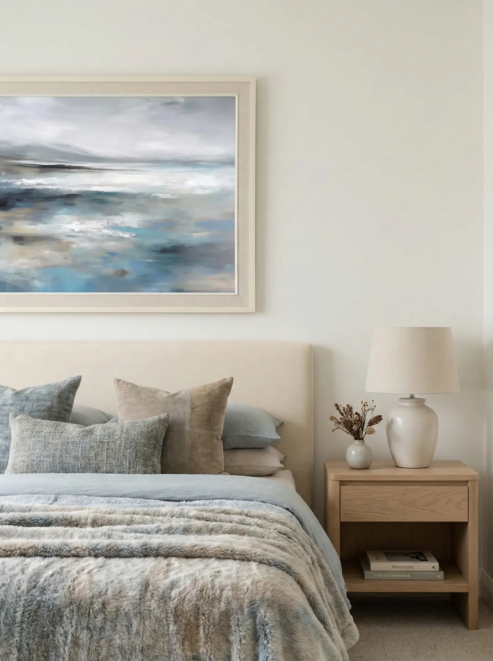
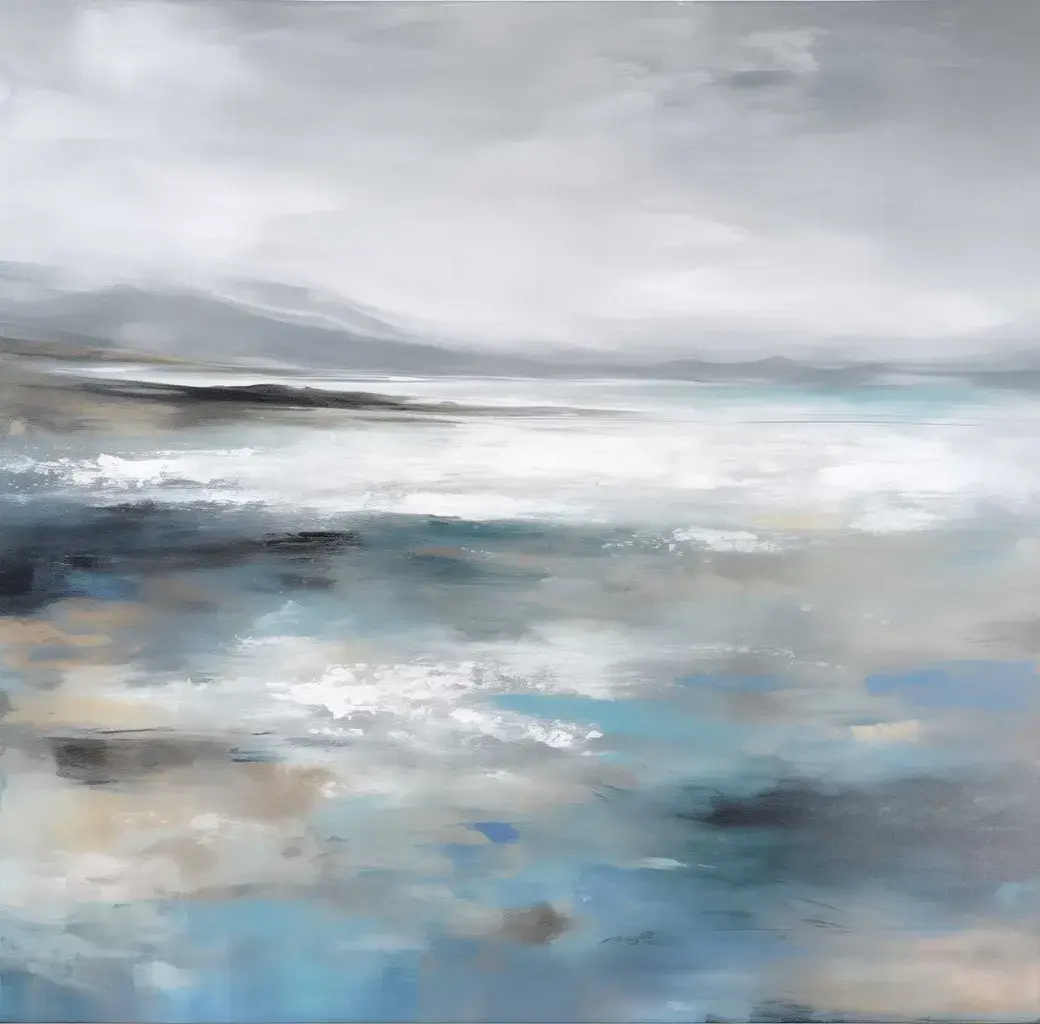
Featured Work - Ocean Inspired03: This abstract seascape utilizes soft grays, blues, and whites, blending sweeping horizontal brushstrokes to evoke the misty, tranquil atmosphere of a distant coastal horizon.
Why It Works: The soft blue-grey tones and hazy horizontal lines cleverly balance the extensive use of creams and beiges in the room, preventing the visual experience from becoming too "cloying." This subtle clash of warm and cool tones adds spatial depth and visual extension. It integrates the quiet, vast breath of the ocean into the home environment, perfectly reinforcing the "relaxed and healing" core aesthetic, making you feel as if you are living by a gentle coastline.
05. Modern Elegance: The Sophisticated Accent
The Strategy: Want your Cream Style home to look expensive? You need a hint of metallic tones and intricate detailing to add a "Modern Luxe" feel.
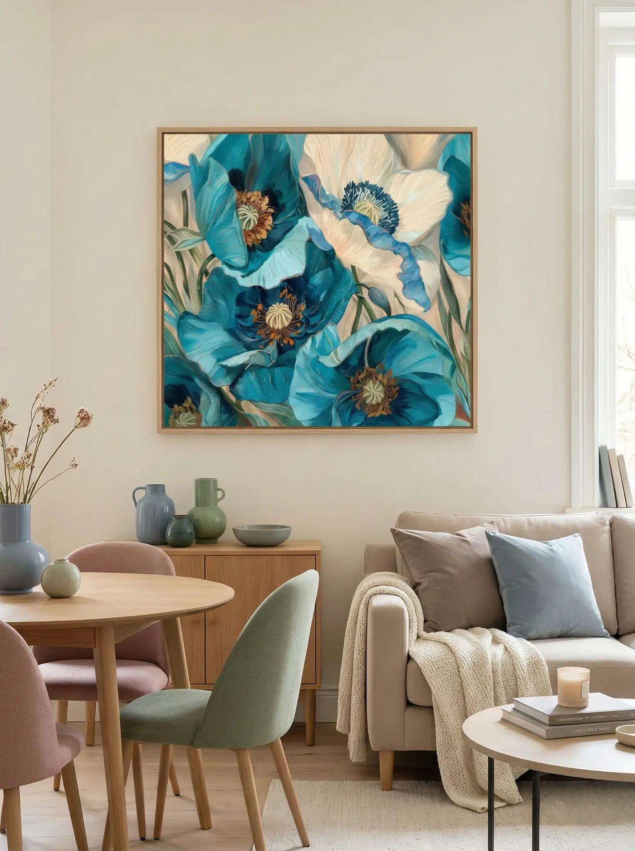
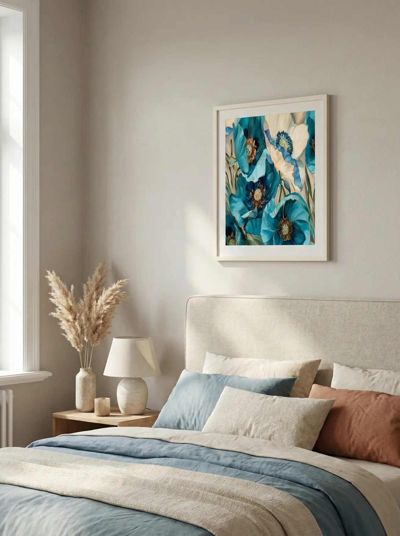
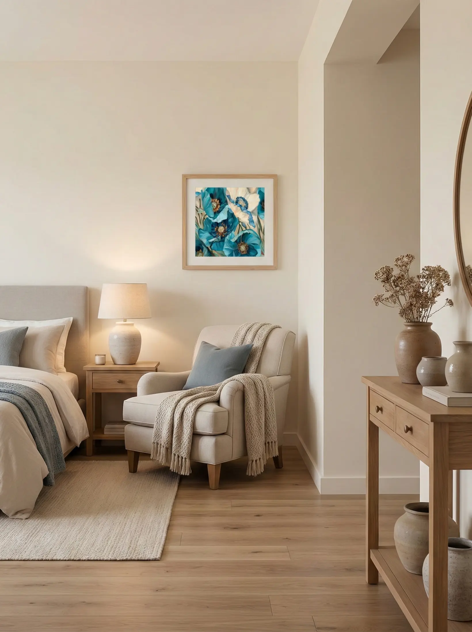
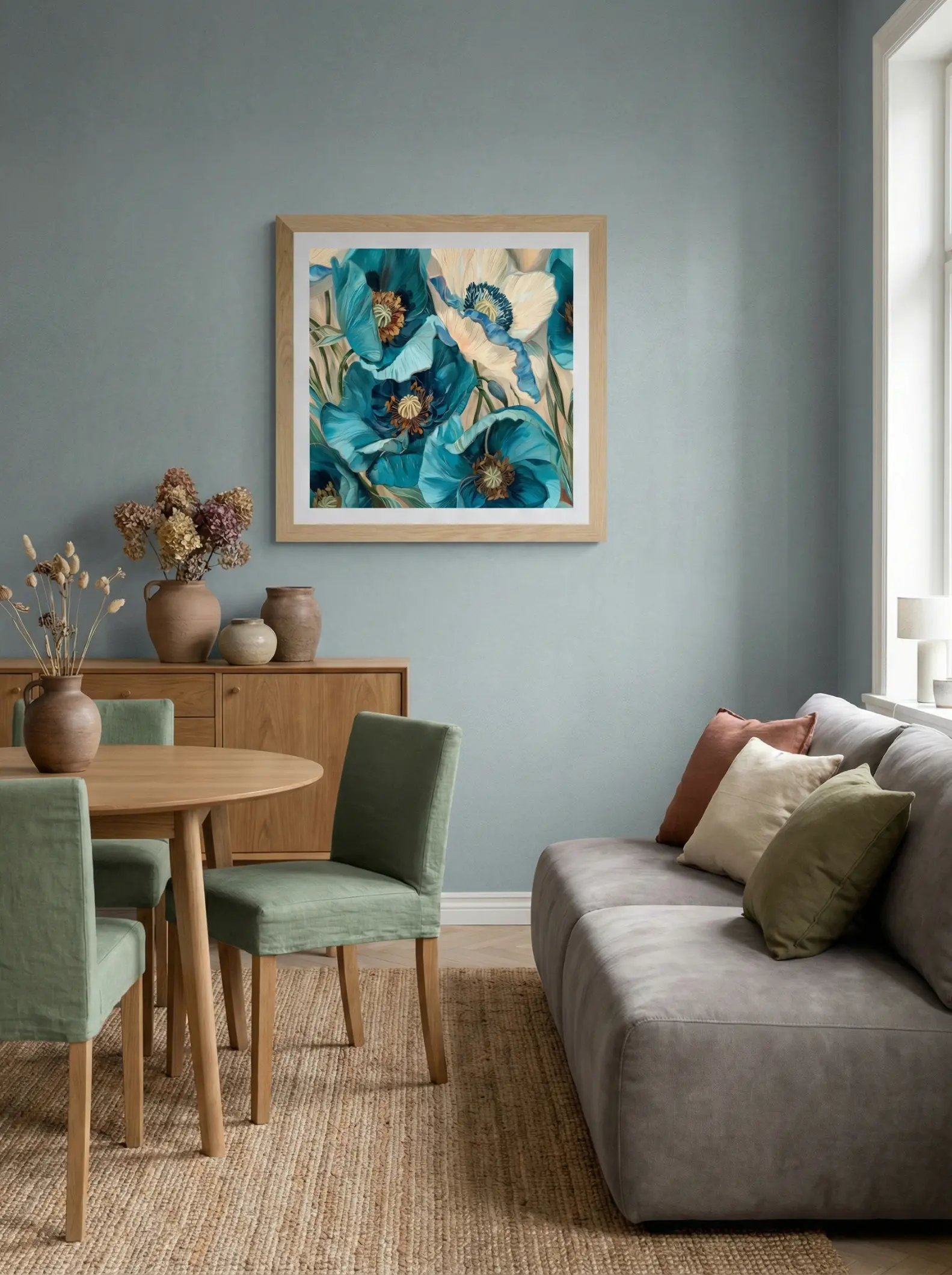
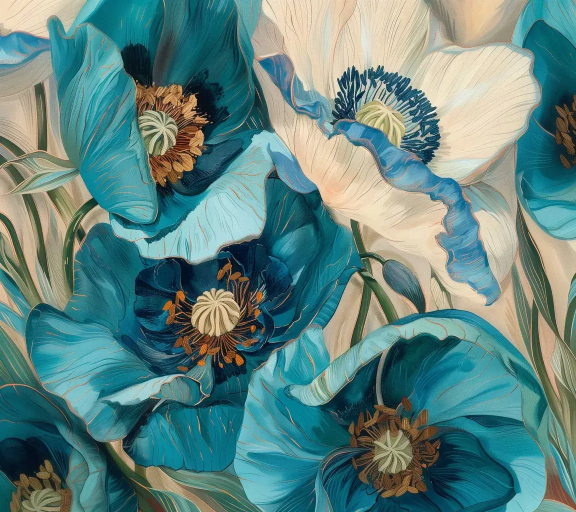
Featured Work - Blue Blossoms07: This artwork presents a vibrant close-up of blue-green and white poppy-like flowers, characterized by intricate petal textures and delicate golden outlines, creating a stylized decorative beauty.
Why It Works: The rich blue-green hues form a striking contrast against a soft off-white base, instantly lighting up the visual center of the room. The exquisite golden outlines in the painting add a touch of light luxury (affordable luxury), perfectly balancing the simplicity of the Cream Style. It brings an elegant modern flair and lively vitality without disrupting the peaceful, healing atmosphere of the space.
Conclusion: Your Home is Your Canvas
Wall art is more than just filler for an empty space; it is a projection of your lifestyle.
Whether it’s fresh florals, a whimsical leopard, or the majestic sea, every piece from FineArt Studio carries a story waiting to unfold in your home.
Are you ready to find the missing piece for your sanctuary?
Explore the collection and find your piece today: 👉 [Click Here: explore more artwork]