
How to Choose the Right Painting for a Minimalist Rental Apartment in New York
Living in a minimalist rental apartment in New York—whether in Manhattan, Brooklyn Heights, or Williamsburg—often means starting with a space that is architecturally beautiful, yet emotionally restrained.
White or light-gray walls.
Clean lines.
Large windows.
Very few decorative elements.
At first, everything feels polished.
But after living there for a while, many residents notice the same thing:
The apartment looks finished, but it doesn’t feel personal.
In minimalist interiors, especially high-end rentals, a single well-chosen painting often becomes the element that completes the space.
Why Minimalist Apartments Still Need Art
Minimalism removes excess—but it can also remove warmth.
In New York rental apartments, this often results in:
- Living rooms that feel quiet but distant
- Dining areas without a visual anchor
- Bedrooms that resemble hotel rooms
A painting does not disrupt minimalism.
When chosen correctly, it grounds the space emotionally and makes it feel lived-in.
Three Rules for Choosing Art in Minimalist New York Rentals
1. The painting should support the architecture
In minimalist apartments, architecture leads.
The artwork should reinforce calm, balance, and proportion.
2. Fewer colors create longer-lasting harmony
Neutral or restrained palettes integrate more naturally into Manhattan and Brooklyn interiors—and remain versatile when you move.
3. Proportion matters more than style
In minimalist spaces, a correctly sized painting can elevate the entire room—while a poorly sized one can disrupt it.
Five Reference Paintings That Work Exceptionally Well in Minimalist New York Apartments
The following five artworks are widely recognized and frequently referenced in contemporary interiors.
They are not chosen for their fame, but for how effectively their visual language translates into minimalist living spaces.
1. Kazimir Malevich — White on White
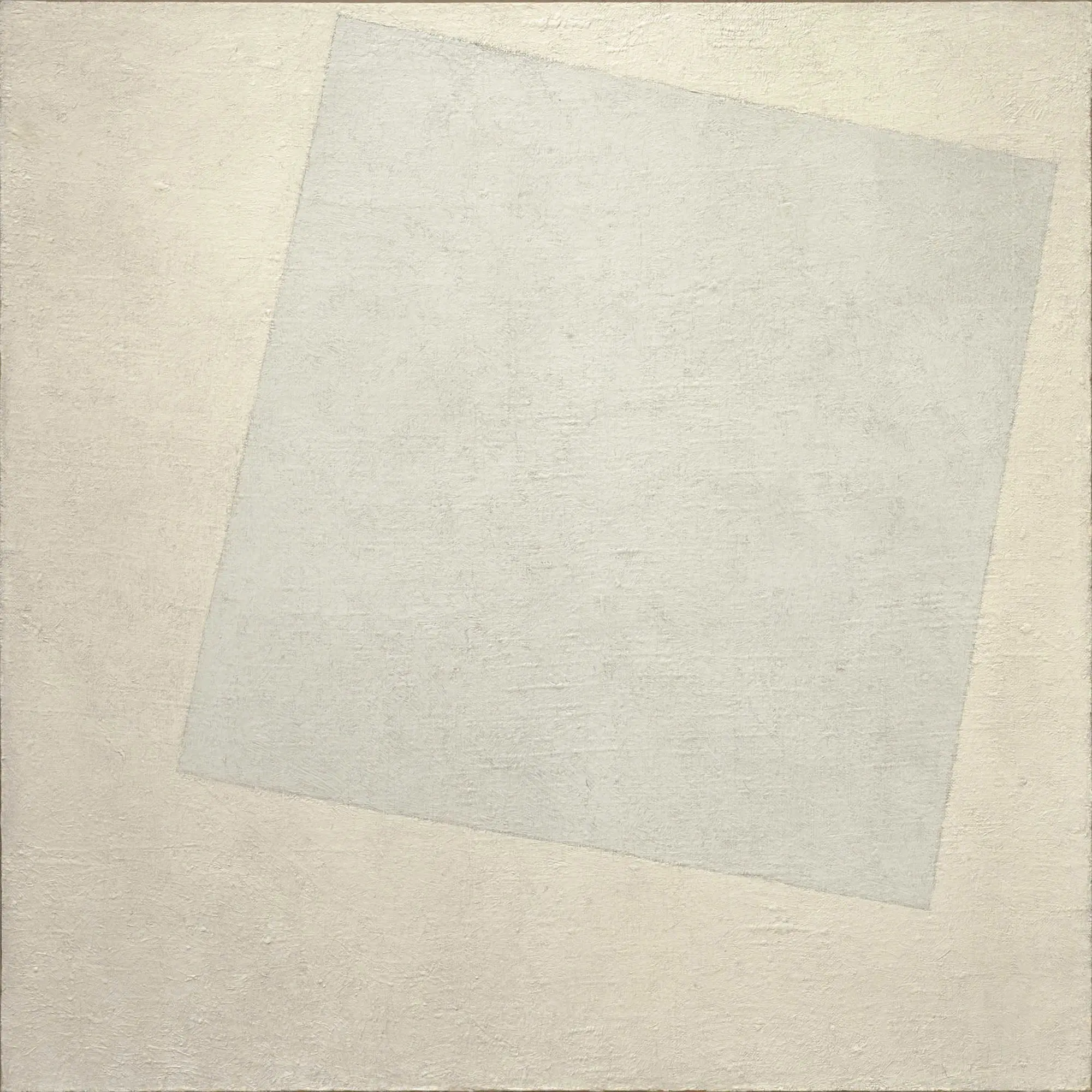
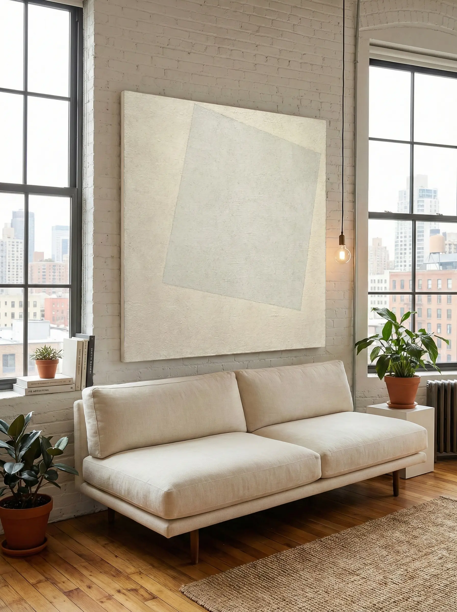
This painting is almost invisible at first glance—and that is exactly why it works.
In a minimalist Manhattan living room, it creates:
- Visual calm
- Subtle structure
- A sense of intentional emptiness
Best placement:
Behind the sofa on the main living room wall.
Why it works in rentals:
It blends seamlessly with white or light-gray walls, making the space feel refined rather than bare.
2. Piet Mondrian — Composition II
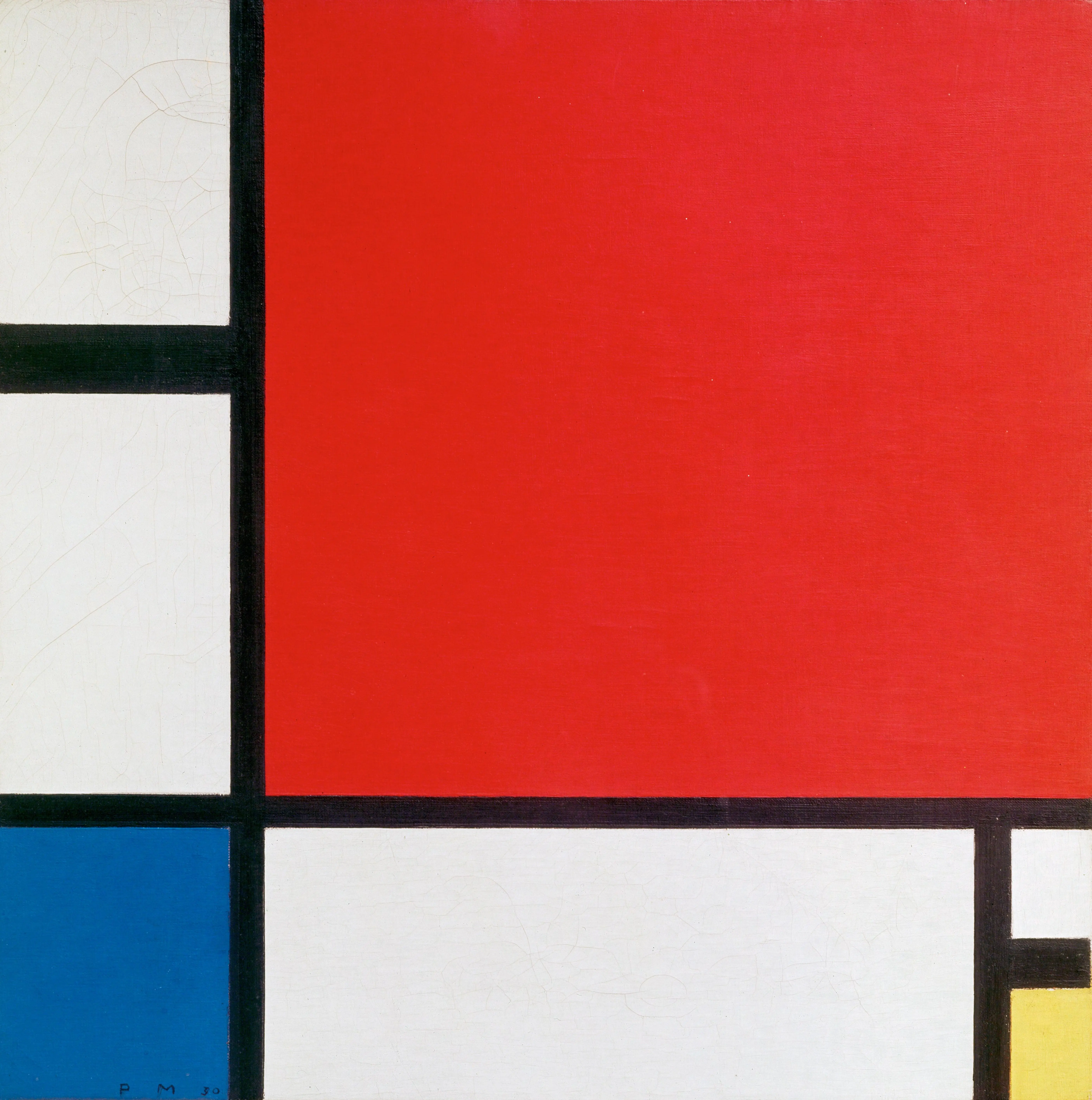
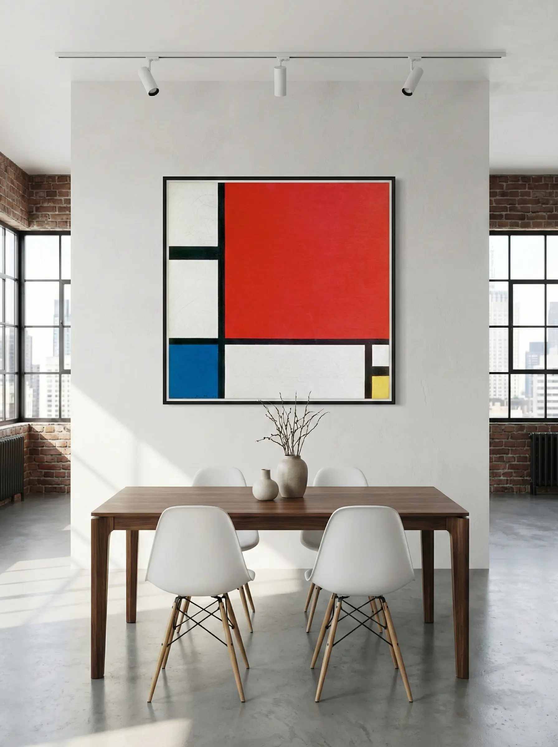
This work introduces order and rhythm without overwhelming the space.
In Brooklyn apartments with open-plan layouts, it helps:
- Define the dining area
- Add intellectual structure
- Balance neutral furniture
Best placement:
Dining room wall or near the transition between kitchen and living space.
Why it works in rentals:
Its controlled palette keeps it timeless, while the geometry adds character.
3. Hilma af Klint — The Ten Largest

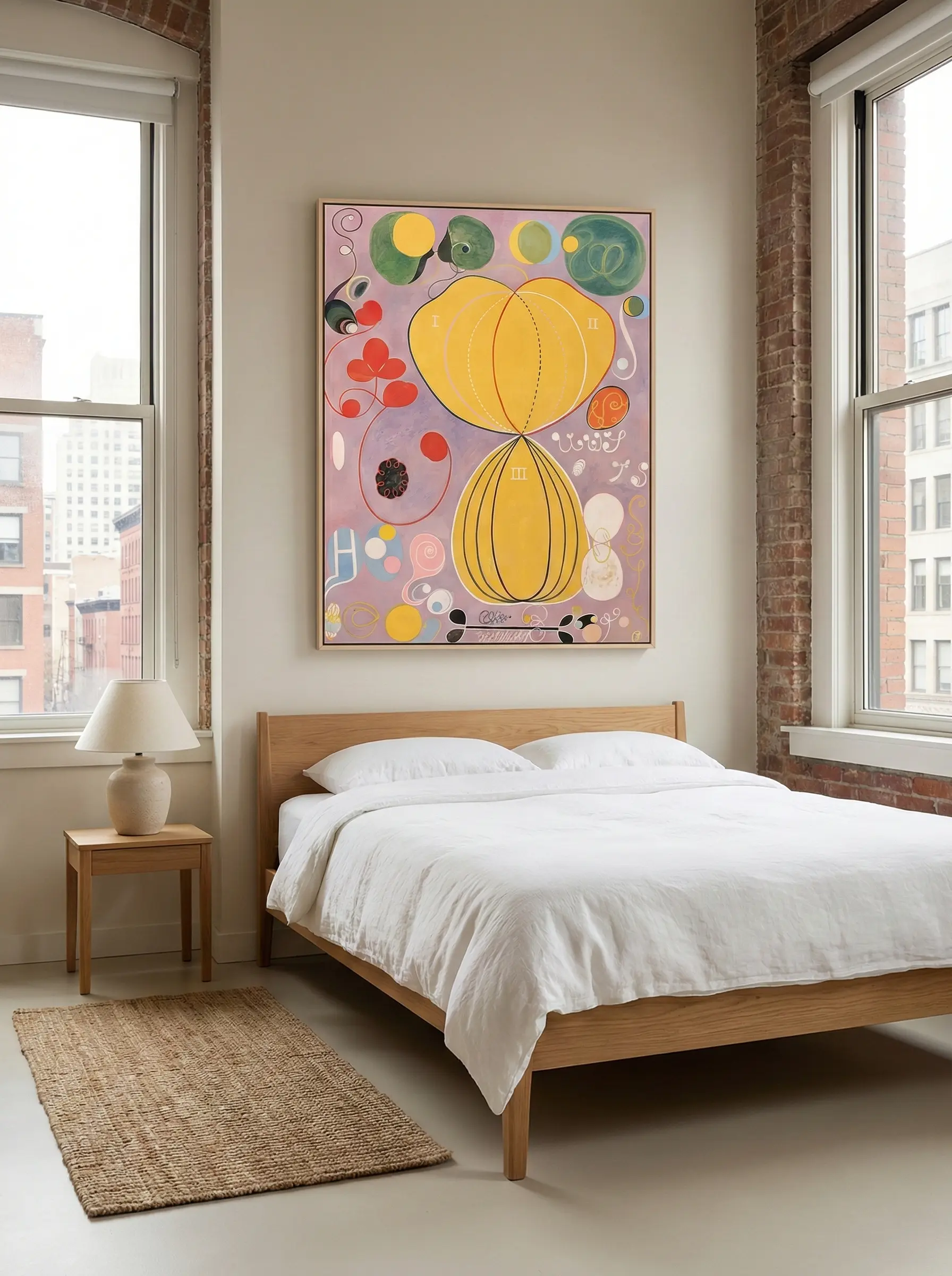
This painting introduces softness into minimalist interiors without becoming decorative.
It works especially well in bedrooms because:
- The colors feel gentle and organic
- The abstraction is emotional, not narrative
- The composition remains calm
Best placement:
Above the bed or on a secondary bedroom wall.
Why it works in rentals:
It brings warmth into neutral bedrooms without making them feel personalized to the point of inflexibility.
4. Wassily Kandinsky — Composition VIII
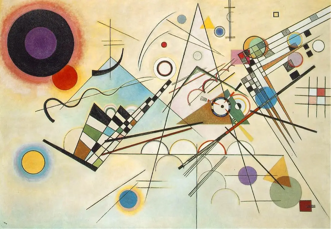
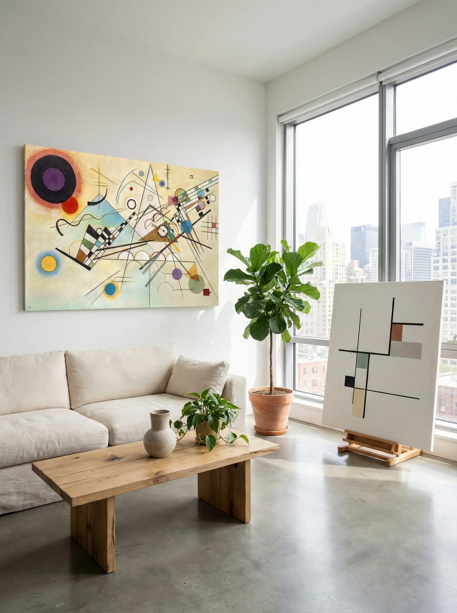
This painting adds controlled movement to minimalist spaces with strong natural light.
In high-floor Manhattan apartments, it:
- Responds beautifully to daylight
- Adds visual energy without chaos
- Prevents the space from feeling static
Best placement:
Living room side wall or near large windows.
Why it works in rentals:
It introduces personality while remaining abstract and adaptable.
5. Paul Klee — Ad Parnassum
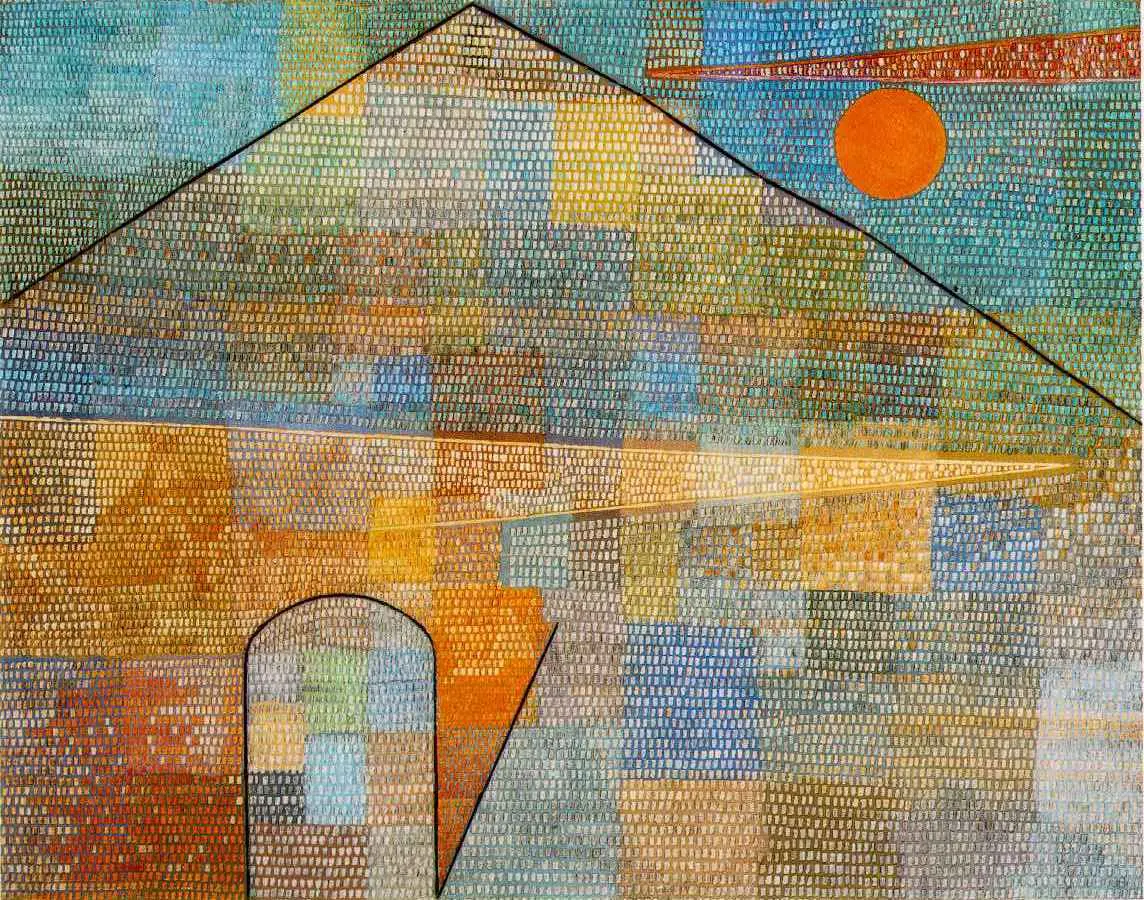
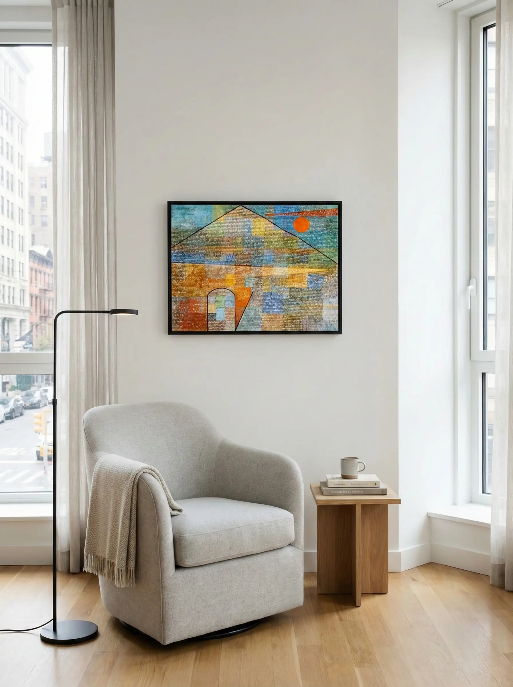
This artwork works especially well in spaces designed for focus and calm:
- Home offices in Manhattan apartments
- Reading corners in Brooklyn rentals
- Transitional spaces such as hallways or quiet sitting areas
Its visual rhythm enhances concentration while maintaining a serene atmosphere.
Best placement in rental interiors
- Study or work-from-home area
- Quiet corner with minimal furniture
- Narrow walls where subtle texture matters more than bold contrast
Why it works for rental living
- Abstract and non-literal, making it adaptable across different apartments
- Neutral yet warm color palette
- Strong sense of order without visual dominance
- Timeless visual language that aligns with minimalist values
How to Translate These References Into Your Own Space
You don’t need museum originals to achieve this effect.
What matters is understanding the shared qualities of these works:
- Abstract, not literal
- Restrained color palettes
- Clear structure
- Subtle emotional presence
- Strong sense of proportion
A well-crafted hand-painted artwork that reflects these principles can integrate seamlessly into minimalist New York apartments.
Final Thought
Minimalism is not about removing everything.
It is about choosing a few elements that truly belong.
In New York rental apartments—where life is fast and homes change often—the right painting becomes a quiet constant.
Not something that demands attention. But something that makes the space feel complete.